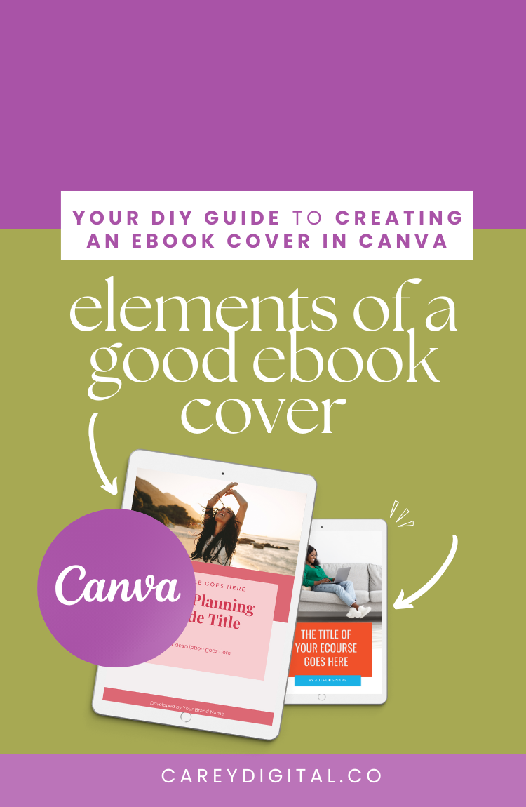
What Makes a Good Ebook Cover Design
Are you creating an ebook or lead magnet to engage your audience?
Here's the first start to the DIY guide to creating an ebook/lead magnet cover
1. You need a clear title
Your ebook/lead magnet title should be easy to read - use easy-to-read fonts at an appropriate font size that your audience can easily read.
2. Identify and use your brand colours
Use brand colours that evoke your desired emotion through your ebook/lead magnet. Use a maximum of 2-3 colours on the design while keeping the design cohesive and visually engaging.
3. Attention-grabbing imagery
Use attention-grabbing imagery that communicates the purpose/topic of the ebook/lead magnet. Your image should be clear with high resolution.
Watch the full tutorial on how to create your ebook cover.
4. Good Use of Space
Don't overcrowd your graphic. Stick to 2-3 fonts. Too many fonts spell confusion and can be overwhelming.
Lastly, make your ebook/lead magnet uniquely yours.
Are you creating an ebook/lead magnet this year? Share what you'll create your ebook about and who it will serve.
Try Canva Pro free for 30 Days
If you don’t already have a Canva account, you can sign up for a Canva account for FREE! Start using Canva to create amazing designs to promote your business easier and more effortlessly with the free version. Still, I would also recommend opting for Canva Pro if you plan on creating multiple creates for your blog, social media or website.
Canva Pro is affordable and packed with unlimited access to millions of stock photos and features that make designing your graphics easier. With Canva Pro, you can schedule your content to social media, resize your graphics with a simple click and even remove backgrounds from your images.

